It is Time to Draw the Pitchmap on Your Cricket Bat
Any moving element in the game can be tracked. Anything that is tracked can be measured, analysed, and improved upon.
The introduction of Ball tracking brought a paradigm shift in the way cricket is analysed and played. Until then, the scoreboard is the primary source of data for any analysis. The concept of ball tracking also allowed for increased acceptance and adoption of video and data analyst roles in professional cricket. In modern-day cricket, the moving ball is tracked in all possible manner on the cricket field – release from the bowler (ball speed and release points), its landing on the pitch (pitchmap), its impact in the batsman corridor (beehive map), its predicted direction to stumps (DRS), the trajectory on and above the field (wagon wheel), etc. When the individual ball data is aggregated and presented in comparison with another parameter (pitch, session, batsman, team, etc.), it becomes a cricketing story.
Bowler Pitchmap - Its Artist, Canvas, and the Story
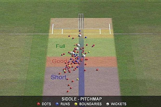
A bowler’s pitchmap is like a painting that invokes multitude thoughts and potential for analysis. If we assume the bowler to be an artist, the pitch becomes the canvas for the bowler to paint his bowling story.
Let us now dissect the elements of the pitchmap art and the way the story is told to the viewers.
Zone the pitch: A ball impact point on the pitch will only inform the viewers of where the bowler had bowled. When you draw and colour the zones (like short, good, full, and yorker), the story evolves into depicting the quality of bowling and the ability of the bowler to execute the plan. For example: If a batsman is understood to have weakness in handling the short pitch ball, the pitchmap will convey how well the bowler had bowled to the plan. Suppose you add the strike rate against these zones, you have the batting performance scorecard right in front of you.

Colour the ball outcomes: While the coloured zones portrays the quality of bowling, colour coding the balls (example: red – dot balls; blue – runs; yellow – boundaries; white – wickets) portrays the effectiveness of the bowling. The bowler knows which line and length get the wickets and which are dispatched to the boundaries.
Thus, when the elements are added and presented on the pitchmap, it transfers the narrative from the ball to match-ups between the bowler and the batsman.
Ball tracking is more for batsman than bowlers:
Contrary to the natural assumption on the use of ball tracking, the system had benefited the batsman marginally more than the bowlers. While ball tracking helped the bowlers understand the zones to bowl against the batsman, it equally allowed the batsman to prepare for such bowling. In the days prior to ball tracking, this analysis was done purely on instincts and experiential wisdom of the coaching unit and players. Today, an analyst or a coach can clearly identify the weakness of a batsman against a specific length or to a bowler. While the batsman’s skill can be analyzed by the bowler, any tactic of the bowling team can be easily decoded and better prepared. For example: If Steve Smith struggled against Ravichandran Ashwin in a match, he can use the bowler pitchmap to identify the zones and come prepared to tackle the length and line from him in the next innings.
The increased preparation allowed for reduced error margin in the game. The batsman can no longer complain about good bowling lengths and lines from the opposing team – he is expected to be prepared for it, rather than anticipating it during the game. The analysis and storytelling also have evolved from individual skills to focusing more on match-ups – who against whom and how well they delivered on their game.
Cricket bat Pitchmap (or Impactmap):
Unlike the ball on the field, the movement of the cricket bat is limited and hence skipped in the video analytics revolution. Except Hotspot, which is used only during the decision review, there is hardly a tech today that can provide data on how well the shot is played. The story of a shot still resides in the way the viewers perceive the shot from the video feeds.
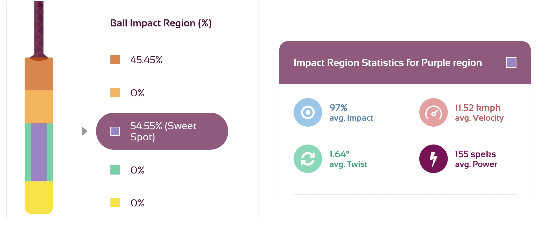
With the emergence of smart cricket bat sensors like PowerBat, it is now possible to depict the ball impact points on the bat. This data can then be aggregated against and presented and compared against other parameters (session, bowlers, bowling types, lengths, etc.). It can be then used for any further analysis by the batsman and bowlers.

For example, assume the bat Impactmap depicts this: In this match, Rohit Sharma played 85% of his shots against Pat Cummins from the sweet spot region of the bat. Oh boy! We know he is in great touch. Like the bowler pitchmap, we now have a canvas and artist to tell the story on how well a shot is played. Or rather, similar to what happened to bowler pitchmap and its cricket coaching use case, it can actually reveal more about how well a bowler tackled a batsman.


Comments